Goal: Implementing a new information hierarchy for CorpusKey, particularly within Outline Management, is a major part of our project and one of the biggest issues with the current interface.
Approach: Test and evaluate a new wording system and information architecture that reduces the learning curve for new users.
Testing
Recommendations


Jump to F nal Design
i
Design Process


Milestone 1:
Understanding of current workflows of instructoes
Milestone 2: Evaluation of the current site
Milestone 4:
New UI Design
Milestone 3:
Recommendations to improve information architecture
Empathize
How do instructors create course material and what are their needs?
How do other online platforms handle AI generated course content?
Interviews:
Interviewed 2 Professors: Dr.B and Dr. H
about pain points and preferences
regarding tools and systems
Comparative Analysis:
Looked into 5 different online course-creation platforms

hover to see insights


Main Paint Points:
Course creation method: they modify existing material every semester.
Wary that AI based tools take away the creativity from the course creation process.
They struggle to understand how Brightspace works.
Preferences:
They like to prepare slide decks for their classes.
A tool would be helpful if it translated the intention of the instructor.
One of them suggested that the AI could help suggest learning objectives and paragraph headings to generate the outline.


Overall Findings:
Coursebox, Magic School, and Taskade offer AI-powered features to streamline course creation and management, but have some limitations in terms of content uploads, editing, and automation.
Canvas has a comprehensive course management but lack AI features, requiring more manual platform management.
Perusall stands out with its AI-based grading functionality, enabling collaborative text annotation and reducing the burden of manual grading for professors.
UX Writing:
Through the analysis we also focused on exploring the different UX writing within the platforms and how they structured their content outlines. Common words that were used included: sub-headings, chapter, topic, sub-topic and others.

Original Website Testing
What does the userflow of the website look like and what are the important tasks to include in testing?
What pain points do users encounter when using the current CorpusKey website?
Heuristic Evaluation:
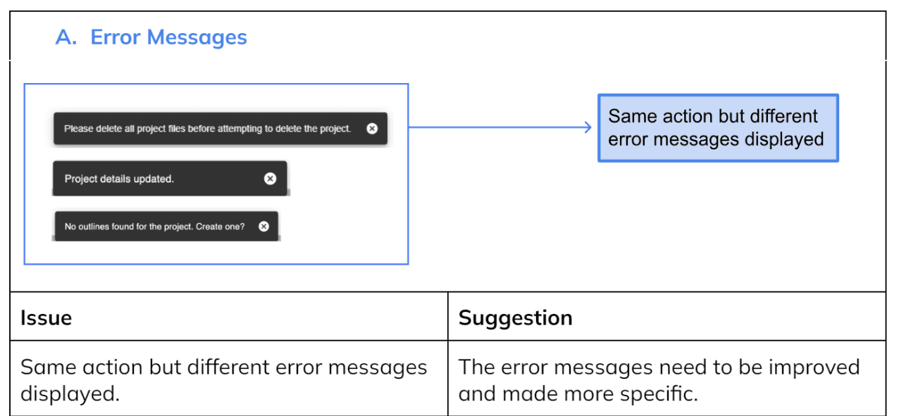
We made annotations of issues and suggestions to incorporate in our design.
Cognitive Walkthrough:
I went through the website and marked up the actions in order to narrow down the tasks for usability testing.
Usability Testing:
Recruited 6 Purdue students and a teaching assistant to participate in testing which had a list of tasks for the participant to complete.


The tasks:
Affinity Diagram of the results:
The hearts and thumbs down were the sponsor's responses to the proposed solutions.
deleting project

creating the project
uploading files


editing the outline

Ideation & Prototype 1
Testing Prototype 1
How to improve the outline management page to be more intuitive?
Design Recommendations:
Through the usability testing and heuristic evaluation, we gathered all the issues and made a condensed list of recommendations to include in the prototype.

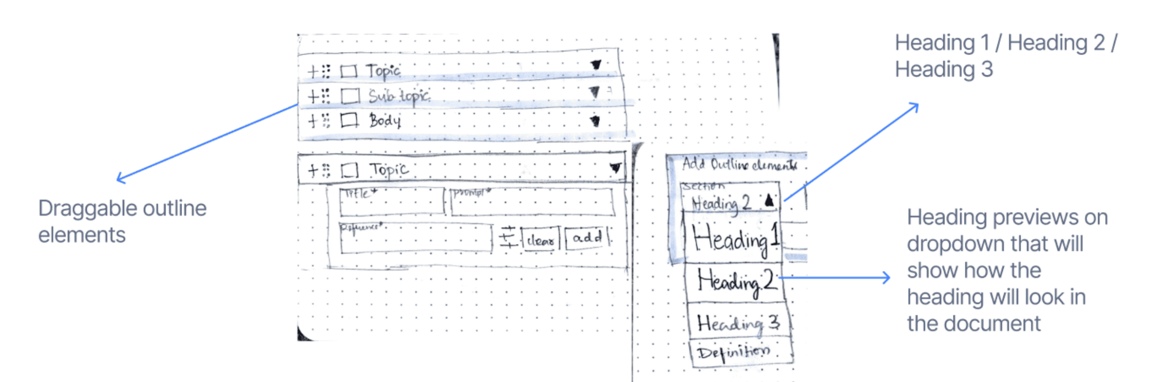
New Terminologies to Heading: Heading 1, Heading 2, and Heading 3 inspired by comparative analysis
Dropdown Preview: Our comparative analysis inspired a feature that allows users to see how a heading will appear in the document.
Draggable Outline Element: The draggable outline elements allow users to easily adjust the position and orientation of the outline
Progress Bar: We suggest incorporating a progress bar as it helps users track their current progress and understand which stage they are in.
Nested Outline: The nested outline features hierarchical headings, enabling users to identify the different levels of hierarchy clearly.
Site New Update Evaluation!


Takeaway: After looking at the results of testing, it was clear that our progress bar design wasn't efficient and didn't communicate the information architecture clearly so it was time for a new design.
While the design team was unaware, CorpusKey’s dev team took in a few of our design recommendations and implemented them into the website like the progress bar.


Our design team wanted to receive feedback on the progress bar design.
Therefore, we conducted a second round of heuristic evaluation and a task analysis to identify new pain points users may be having with the site. Here are the main insights:


Milestone 4:
New UI Design
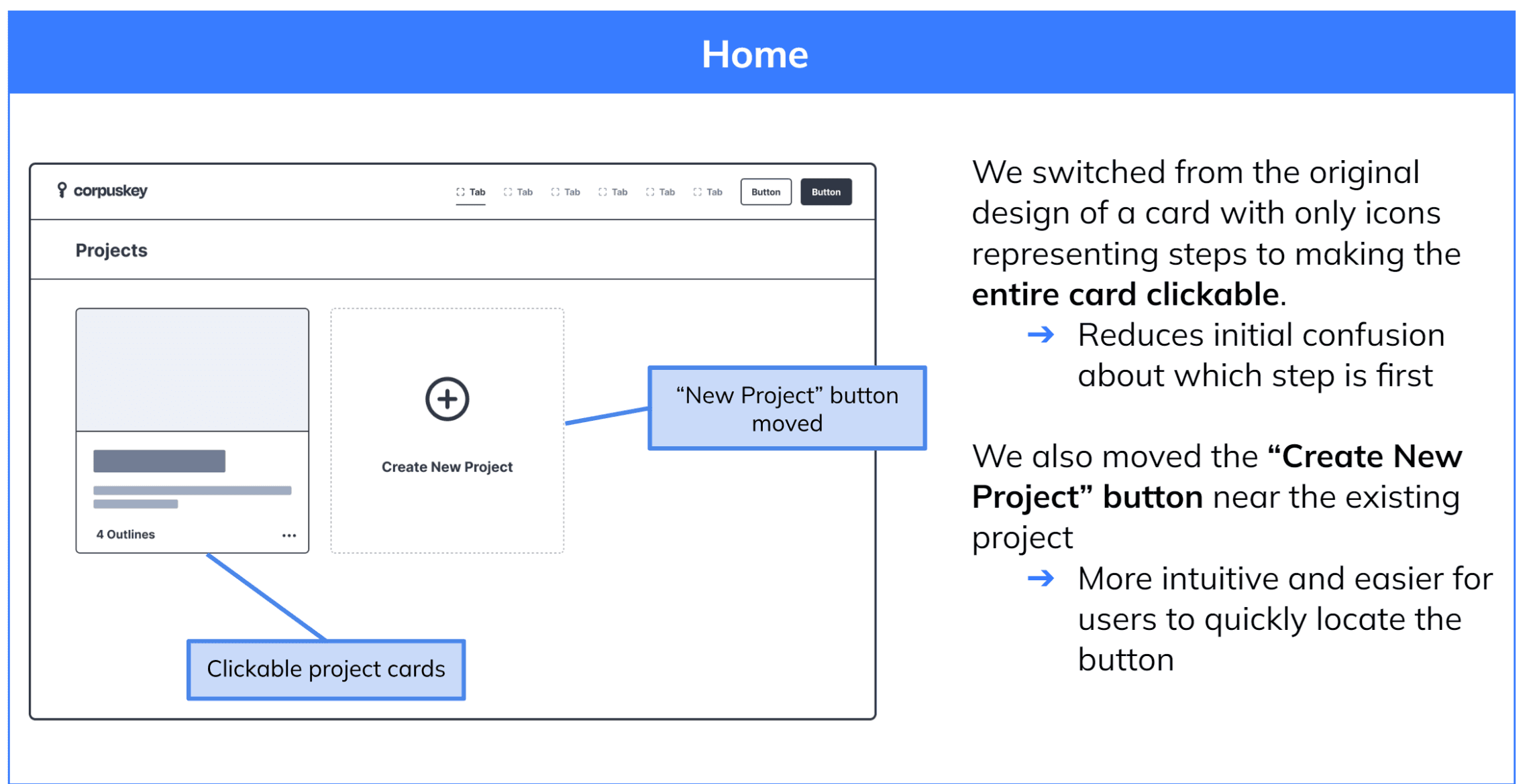
Goal: After learning from our previous design, we wanted to create a new information architecture for the outline management page that is more user-friendly.
Approach: We started to prototype a new solution by brainstorming and doing a showdown for us to get many options for features to add in the final design.
Brainstorming
Mid-Fi Showdown
Prototyping
Testing
Ideation & Prototype 2
What is a better prototype that encompasses all our feedback?
Brainstorming:
We decided to run a brainstorming session to think of more ideas.
Mid-Fidelity Showdown:
After coming up with the general structure of the page, we did a Mid-Fi showdown where all the group members made their own interpretations of the design.


During our session, we came to the consensus of going back on one of our previous ideas, which is a one page outline management system.
Rationale: The user can easily go back the previous step without thinking there is a number order.

Collaboration:
As a group, we went through them all and talked about the features we should include and things we shouldn't.
We all agreed that we shouldn't include a number system since the steps can be done in any order.

my prototype for mid-fi showdown
all the mid-fis my team came up with
Mid-Fidelity Prototype
After putting all our ideas together, me and another teammate drafted the mid-fidelity prototype so we can do testing with it.


Usability Test: Card Sorting

Final Design
In order to ensure that the final prototype was easily understood and accessible, we conducted card sorting activities with our user group (5 Graduate TA’s in different academics).
We used card sorting, tasking participants with arranging labeled cards into both an outline hierarchy and a chronological sequence of steps.
Conclusion:
The participants were able to arrange the cards in a way that represents the information architecture followed by the redesigned website. This validates the information architecture followed in the redesign.
The participants also followed the chronological sequence of steps of creating an outline in the same structure as the website thereby affirming our design approach.
This is our final design which is an interative prototype of our high-fidelity design so you can click through it. Our stakeholder was very satisfied with the result and this design is now in development!
Contribution Overview:
I was involved in interviews, testing, and prototyping because I wanted to work on my testing skills. I did the wireframing and prototype for our primary solution to show how we wanted the outline managment page to flow. I enjoyed keeping the team talking and collaborating by often asking questions to the team; by the end of it we became really close friends.
What I learned:
This project was special because while my team and I worked on giving the company design recommendations, we had to keep adjusting and testing when the site would recieve new updates. It is important to communicate and test before the developers recieve design suggestions so that their time is not wasted.
It was a new experience where I learnt how to be agile and flexible with designing and I saw how important it is to stay open to ideas instead of being fixed on one design as after testing with a different one you may get different results to what you expect.